Costumer service platform

eManuals is KeyBank’s platform for comprehensive policies, procedures, and guidelines designed specifically for contact center associates.
Overview
-
Led cognitive walkthroughs with KeyBank contact center employees to identify key challenges and problem areas.
-
Facilitated usability brainstorming sessions to generate solutions for improving information architecture, organization, and UX/UI of the platform.
-
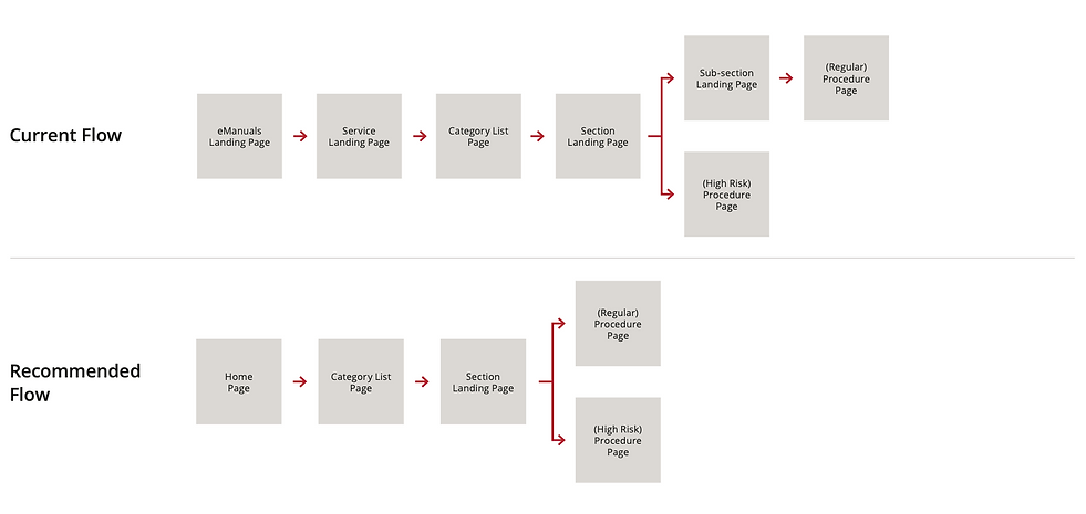
Streamlined user flows by reducing the number of pages for quicker navigation.
-
Integrated UX trends, heuristic principles, and the KeyBank Design System into final design recommendations.
WORK DONE
-
User research
-
Usability testing
-
Ideation & brainstorming sessions
-
Information architecture
-
Wireframing
-
Lead UX design
Ideate on the right problems
WHAT WE LEARNED
By identifying themes and insights from the cognitive walkthroughs with employees, we uncovered our user’s pain points.
PROCESS
During brainstorming sessions with other UX designers and researchers, we engaged participants with “How Might We” questions to turn our user challenges into design opportunities.
PARTICIPANTS PREFERRED
-
Clear hierarchy of elements and text on each page.
-
A wizard tool, or similar feature, to reduce the length of procedure pages.
-
A trending topics section featuring popular links on the landing page.
-
Expandable content sections with drop-down, show/hide functionality.
-
Relocating the revision history to a more visible area.
-
Grouping related tasks and links together for easier access.
How might we...
-
Make the procedures easier for users to consume/walk through?
-
Provide users with a way to easily access their most used procedures/policies?
-
Provide users with a way to access their previous searches?
-
Alert users of high-risk procedures and when procedures have changed?
-
Make a complex interface quicker for the user to navigate through?

User flow
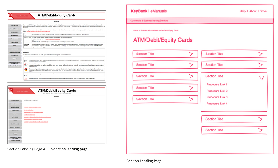
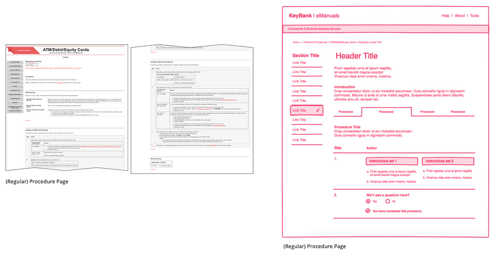
Wireframe recommendations


This is a project I worked on while employed at Clutch